
These are mine and Kate's final artifacts that we produced for monday's crit
This is an advertisement cube to promote the conference.


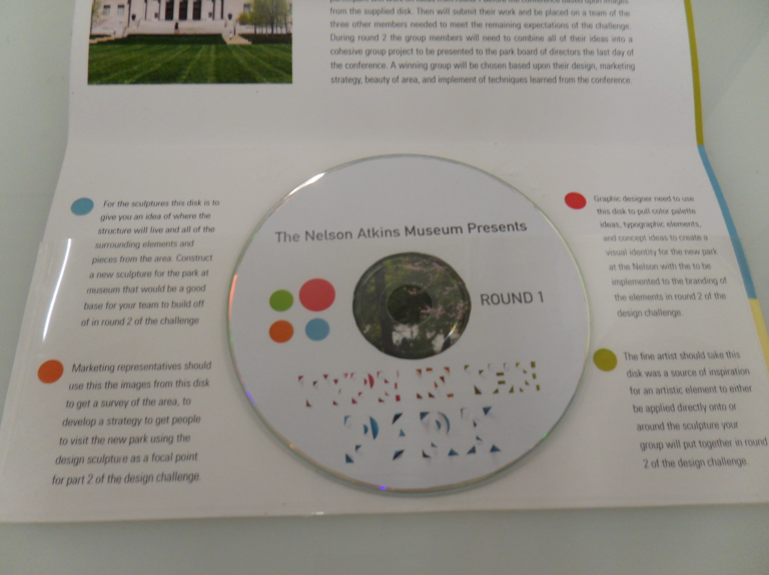
This is the informational mailer that would be sent out to all the attendees that were going to participate in the design challenge at the conference. This challenge is called Type in the Park and participants would be designing a sculptural piece to reside in the new park going in at the nelson. As part of the group they would be developing an identity for the park as well as a marketing plan to get the community to this park, and of corse a beautiful unified and appropriate message to reside on in the environment In this mailer they would receive a dvd of images for them to put together part 1 of their challenge before they are divided up into groups and asked to merge ideas.


Website where attendees can register, access our style guide, look at featured artist bios, and learn more about the conference, and see examples of work.


3 comments:
Wow! You girls really pumped it out. I was really amazed at how well you worked together, and how well your ideas/concepts molded each others thoughts and ideas to come with the amazing things that you did.
I think though, that if I didn't already know what the logo said, I wouldn't understand it. I just feel that legibility might have been pushed too far on it. I think its beautiful, and awesome to look at, but needs more. I know its something that you wrestled with time and time again but I think it needs more work.
I think the challenge is a great idea, but maybe not do it as a volunteer basis. Break people into teams, and give out the other people's e-mails or contact info to get the first round started. I like the idea of it and that's the reason that I would probably most likely want to go to the conference.
I'm really glad that you girls put as much work as you did into it, just push it further. It's great! It really shows progress and you really worked well together to fuse what you both liked. Maybe the sculptural thing was lost in a way, more flat on multiple surfaces, but other than that really great. Way to go!
I really enjoyed the color palette that you ladies chose, because it gave me a good sense of energy and interest towards the conference.
The idea behind the colored dots was interesting to me, however I think you might have a problem if you labeled a person as "fine artist". The term is quite broad, and some fine artists might not like being "labeled". I know we also discussed the fact that sculptors themselves are considered fine artists, so the grouping does need to be re-figured.
I absolutely love the idea behind the cube, and it totally backs up the logotype. It is something tangible that I probably will not forget. It explains, in 3-dimensional form, the entire conference theme. It is extremely persuasive to me.
I feel that the logotype is too illegible, and I wish I wouldn't have seen it before today. I would make sure that people can read it, so maybe testing it on complete strangers just to make sure they automatically can read it. That would be good just in case it isn't legible.
The layout of the website seems nice so far, but I would like to see a bit more micro vs. macro reads. I know that the logotype is larger, but since it only frames the letter forms it doesn't take up enough space to contrast the smaller body type.
Overall, the website and design of the entire conference artifacts seem very clean and refreshing. This is probably something that I would be attracted too. Very nice work! I enjoyed the presentation!
I love how you have used the dots as a labeling system. I feel like you should choose your groups more broadly though. I really like the direction that you logo is taking. I feel though that having it really small in places it loses legibility I do not know if there is something less distorted you could add in part of this to relay what the conference is called. I love the new colors that you chose. They are way better than the wonder bread colors you had before. I really enjoy the analog rendering that you took on this. It really made your logo come together.
On the promotional pieces I feel like they are most interesting when there is interaction involved in taking in information. The cube is a brilliant idea showing messages across different surfaces really brings your whole theme together. Good job on that! Now how can you apply this to others?
Post a Comment