


my concept behind this whole book is to make it for everyone. I did this by trying to balance text and image. This way if you are more of a visual person this book can interest you, and if you are a context person there is plenty for you to read as well. I also used this im my typography as well. There is big and small text so any one from the old to the young can find something to enjoy in this book. I wanted there to be alot of breathing room in my layouts. I needed the text to feel approachable and not overwhelming and turn people away.
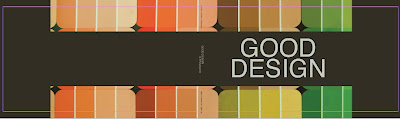
As for my cover i chose to find colors that are apparent in his work. I felt that he had some very strong and precise color palette. By using paint chips this makes it more relateable to the general person that they could go out and get these colors on their own. Also that these colors could work in there own homes to coordinate with other things.
I used a 3 column grid with a break in the middle at 4 inches. These where my 2 main rules to follow.
No comments:
Post a Comment