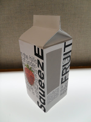
So far along in the juice world exploration is looking alittle grim. I am struggling with making adequate and constructive experiments. I started out last week just learning through mass learning. The main question I tried to accomplish is to play with/ alter placement of ALL of the elements that are found on the juice container. However while doing that I also dabbled into areas of hierarchy, scale, and the different was a juice box can be viewed.


But last night I tried to focus on one element, like I was instructed in my posit notes. So I picked the element strawberry. With this element I wanted to think of many different ways that strawberry could be portrayed. I used many wrapping techniques and clippmasking.
With the image in the left I am working with a very simple typeface "Helvetica" that has no negative or advancing connotations. I started by making the word just black set in the typeface which is the constant. Then I began adding more and more information to give it extra meaning. By filling it with strawberries or even surrounding it with the fruit. But then at the bottom I asked for the viewer to assume their all ready know knowledge of what a strawberry looks like and I introduced the element of a real bannana.. So does this make it strawberry-Bannana or is it still just strawberry?? Then on the right i took the word strawberry and brow it up in its natural break..between the straw- and berry and masked it into a strawberry picture giving it not only the shape but the texture as well. Texture is one element that I addressed in all of the masked words. I looked at the obvious texture and focused on how to give added clarity to the word. But now I want to look at how I can change the meaning of the word through the texture.
On these I focused on the curvature of the strawberry and trying to give more meaning or structure or implied shape to my typeface/ word. I also added a straw to the berry as a pun/ play on words and the added berry.. This way it is not just smacking its viewers flat in the face but having them piece the different parts together to get the meaning, while still giving them clues.
here I am looking about one idem over 4 different boxes. There for the viewer would either have to buy all 4 products of have all of the information or have to arrange them strategically on the shelf so that all the information is given.
Then next thing I am going to look at is if the nutrition lable is all on one box but stretched over all four sides.
I am also going to really focus on hierarchy by making every thing the same size then calling out just one element to make big and hold the focus of the viewer.
Also I want to look at further on how to make the strawberry word have connotations of strawberry fruit..such as juicy, sweet, ripe.....
then how can it have connotations the are opposite of a strawberry...dry, bitter, dead
and see what that does to the identity of the juice and its reaction on its viewer...
I have a big week of exploring ahead of me..thanks tyler


No comments:
Post a Comment